Safety, but Make It Human

Services
UI/UX Design
Branding and Identity
Client
University Project
Agency
Loughborough University
Year
2025
Credits
Images generated with AI
Building a safety app that doesn't "Suck"
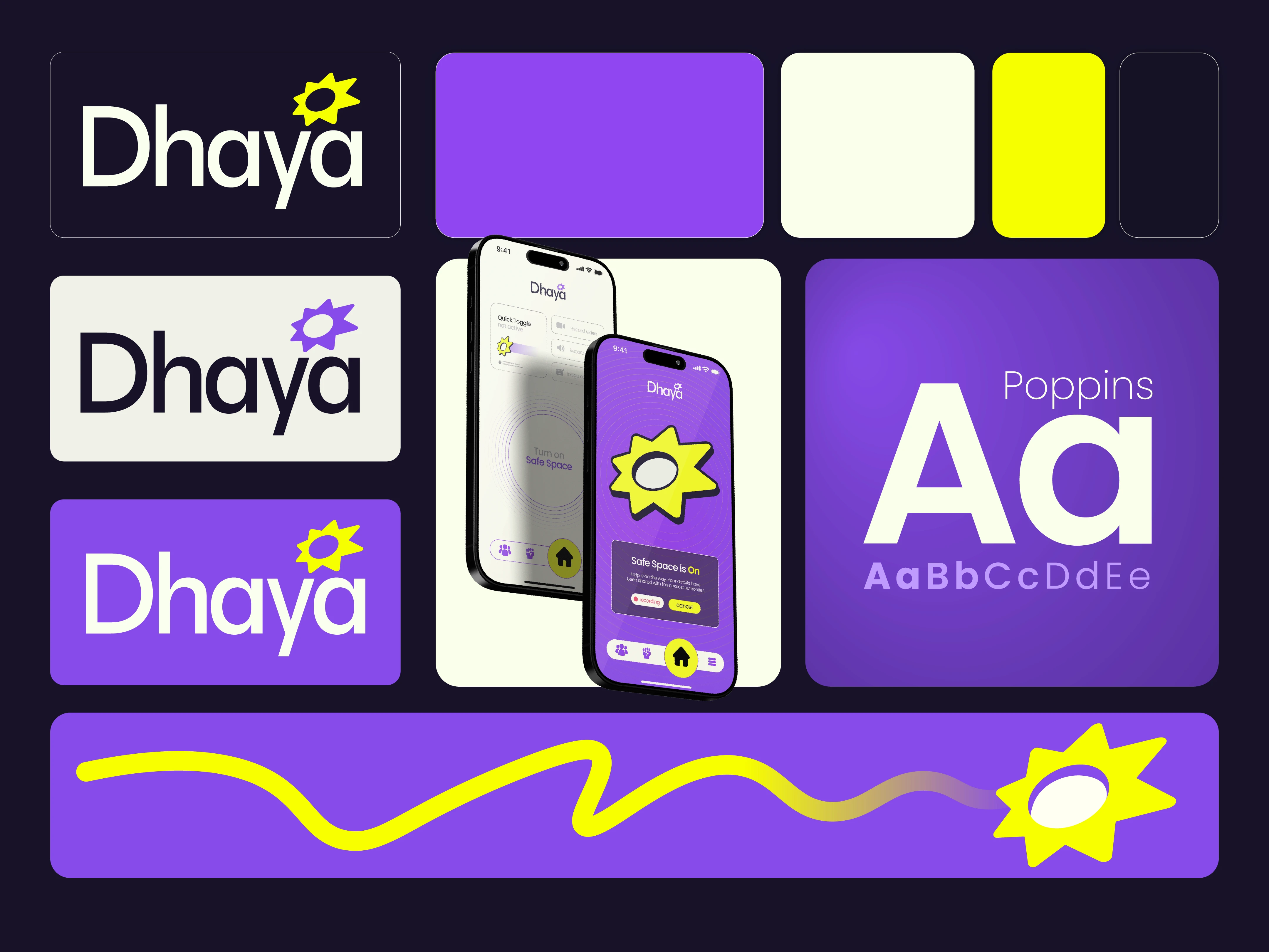
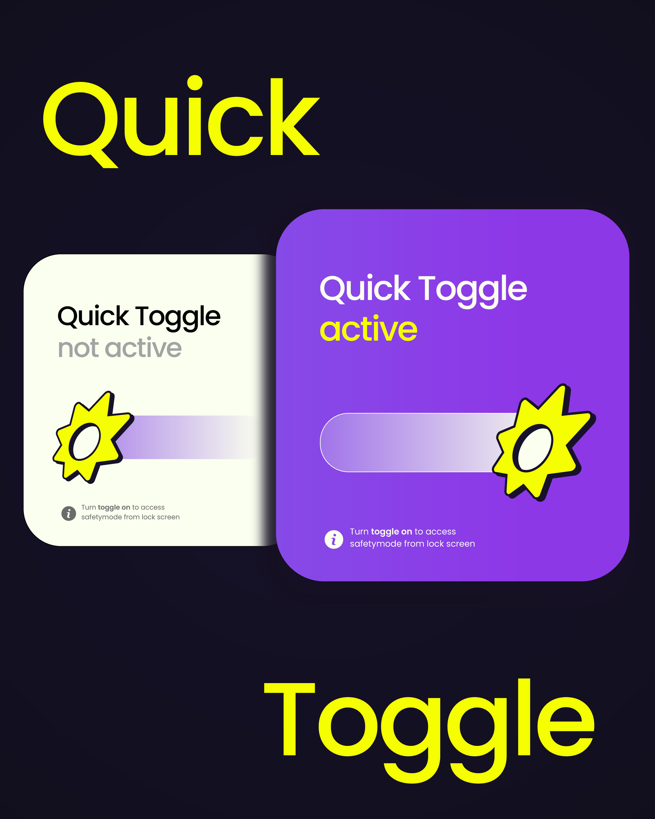
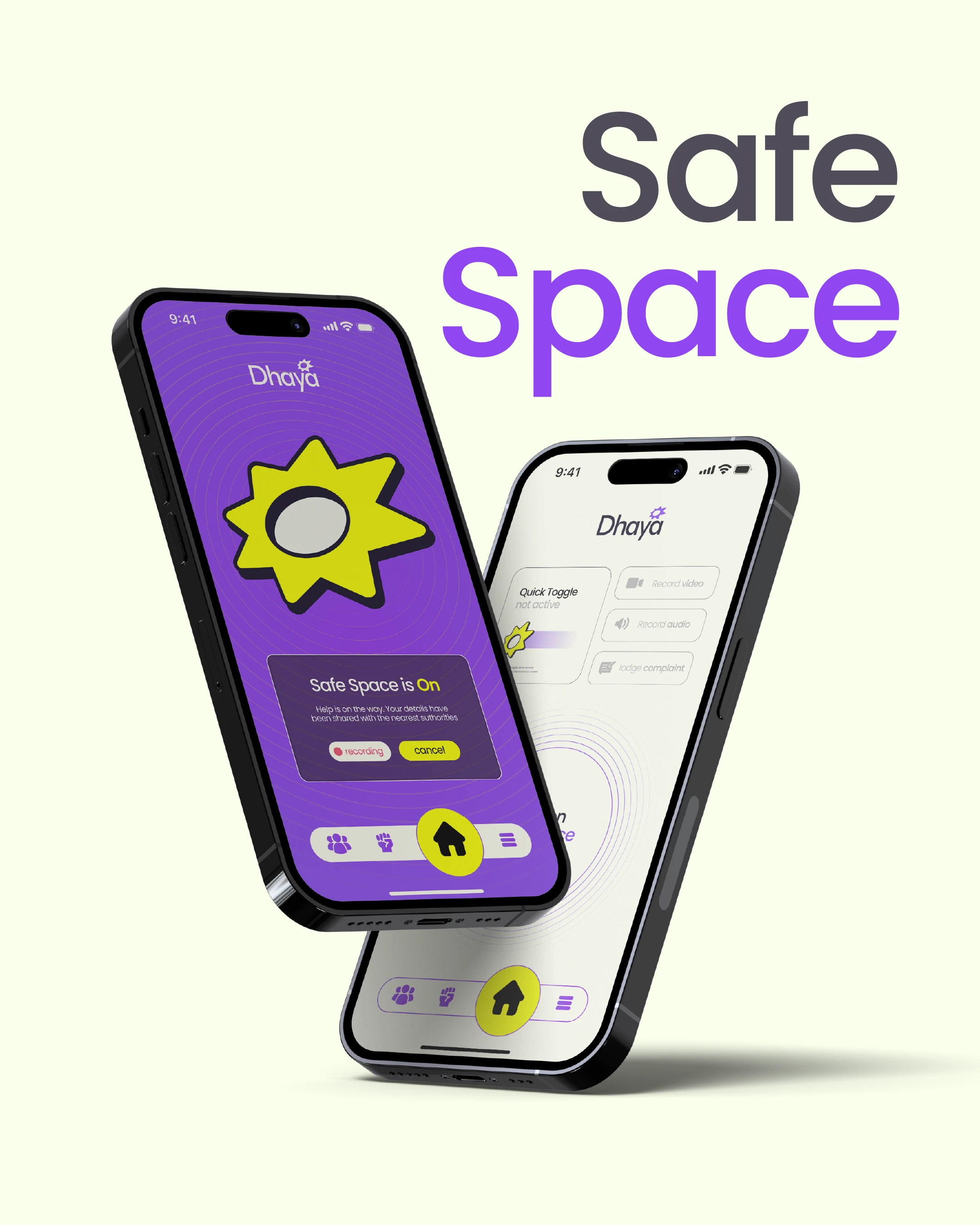
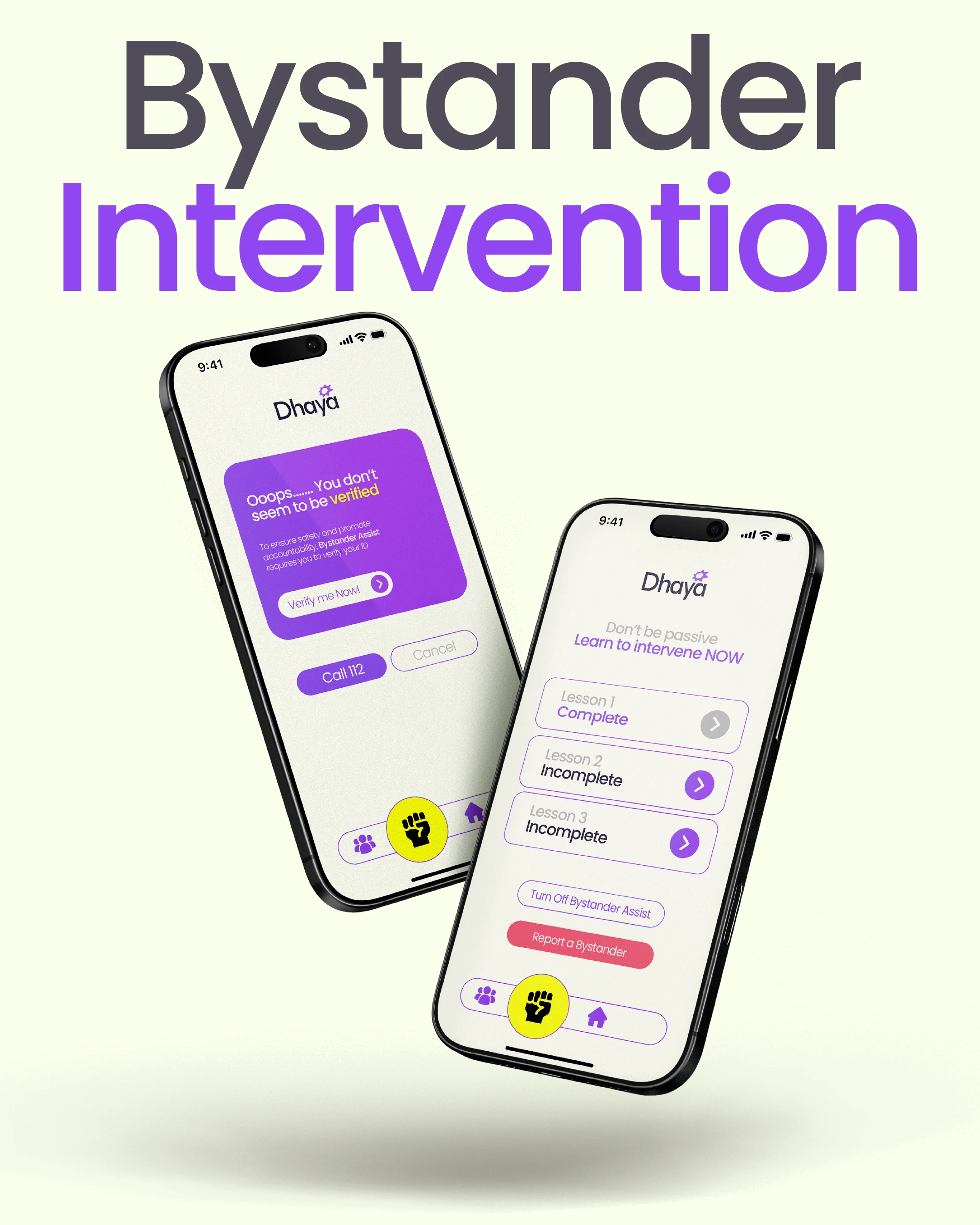
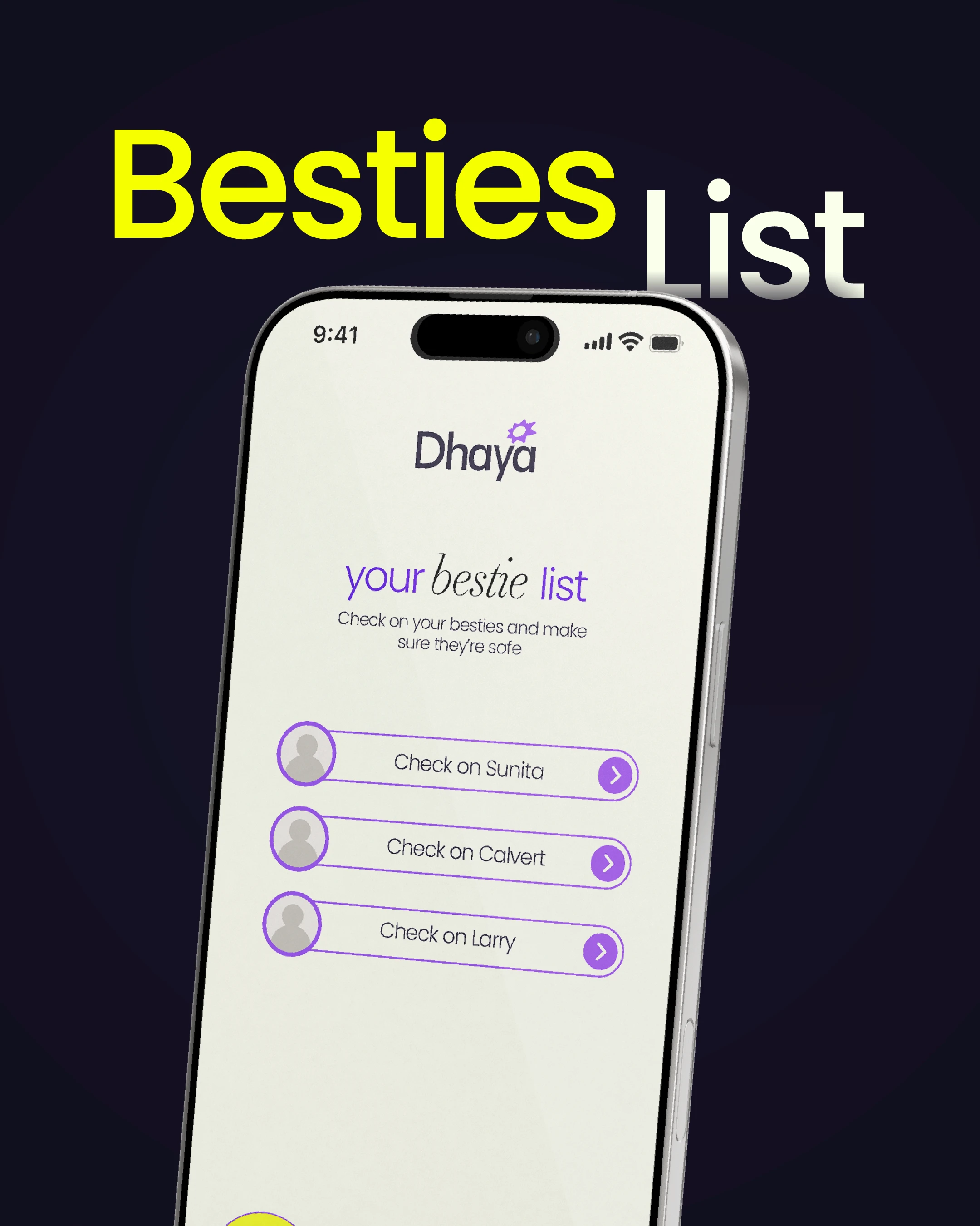
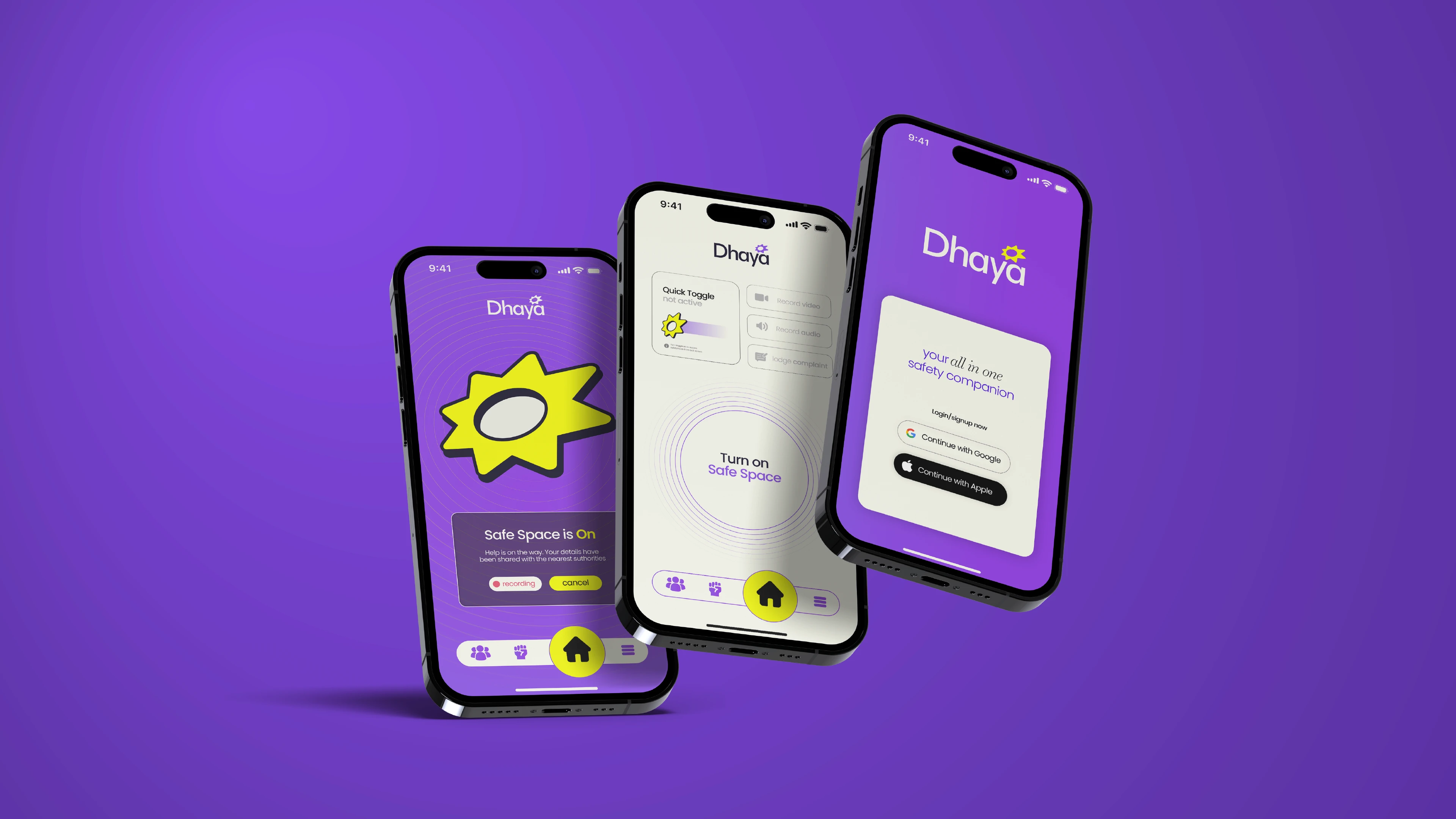
Dhaya was created as an efficient and effective response to the shortcomings of existing safety apps, which often felt slow, complicated, or overwhelming. The goal was to design an experience that worked seamlessly in moments of crisis : fast, reliable, and easy to use. Features like Quick Toggle, Safe Space Mode, Bystander Intervention, and the Besties List were designed with clarity and accessibility at the forefront. The interface avoids the monotonous, clinical tones of traditional safety apps, instead using bright, engaging visuals that invite users in rather than intimidate them. Every interaction was built to feel intuitive, empowering users with confidence in their own safety and in the community support around them.
An identity rooted in empathy
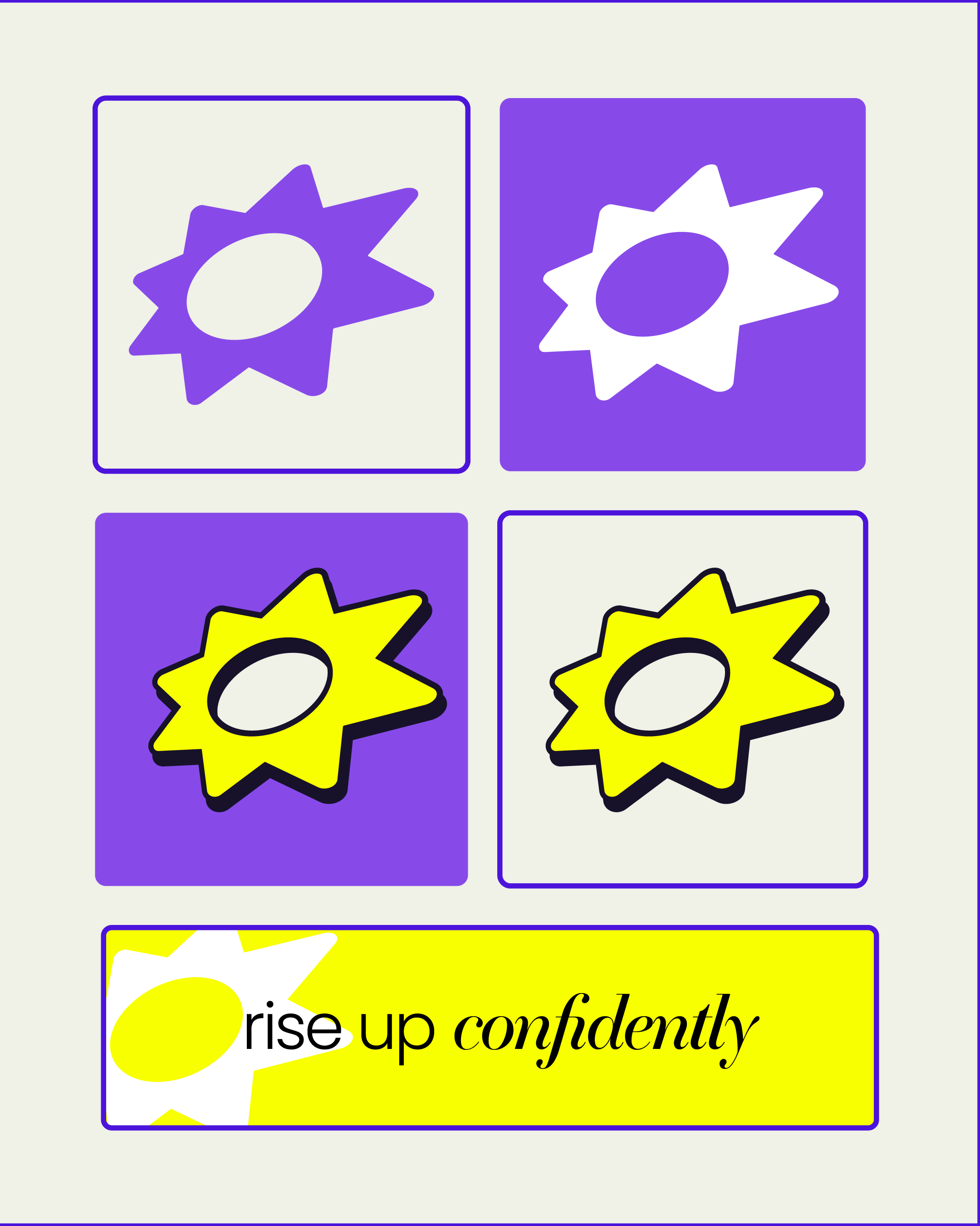
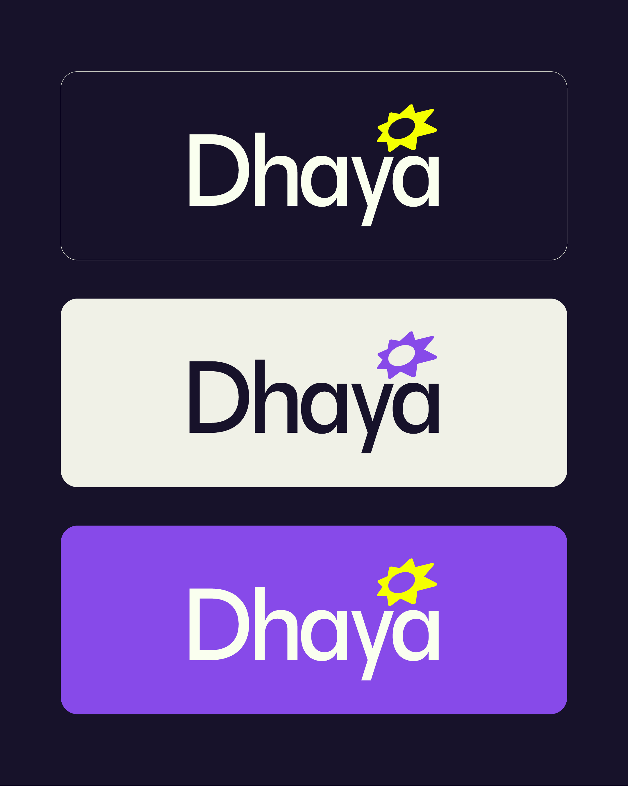
The identity of Dhaya was designed to embody compassion, solidarity, and empowerment. The monogram mark takes inspiration from the sunflower — a symbol of resilience and mutual support. Though not botanically literal, the sunflower myth of “turning to each other for light” became a powerful metaphor: in moments of darkness, people can find strength in one another. This imagery translates into a bold, open mark that feels warm, protective, and unmistakably human. The name Dhaya, meaning compassion and kindness, was chosen to resonate across India’s diverse linguistic and cultural landscape. Rooted in both Dravidian and Indo-Aryan traditions, it carries universal accessibility while grounding the brand in empathy. Paired with a clean, sans-serif wordmark, the identity balances clarity and authority with emotional warmth. Bright, energetic colors break away from the muted tones often seen in safety apps, signaling optimism and approachability without compromising trust. Together, the symbol, name, and system form an identity that is both protective and empowering — a brand built not on fear, but on solidarity and confidence.