Amping Up a Legacy
Services
Packaging Design
Client
Heinekin
Agency
Wunderman Thompson
Year
2022
Credits
Wunderman Thompson (Now VML)
The same thing, but louder
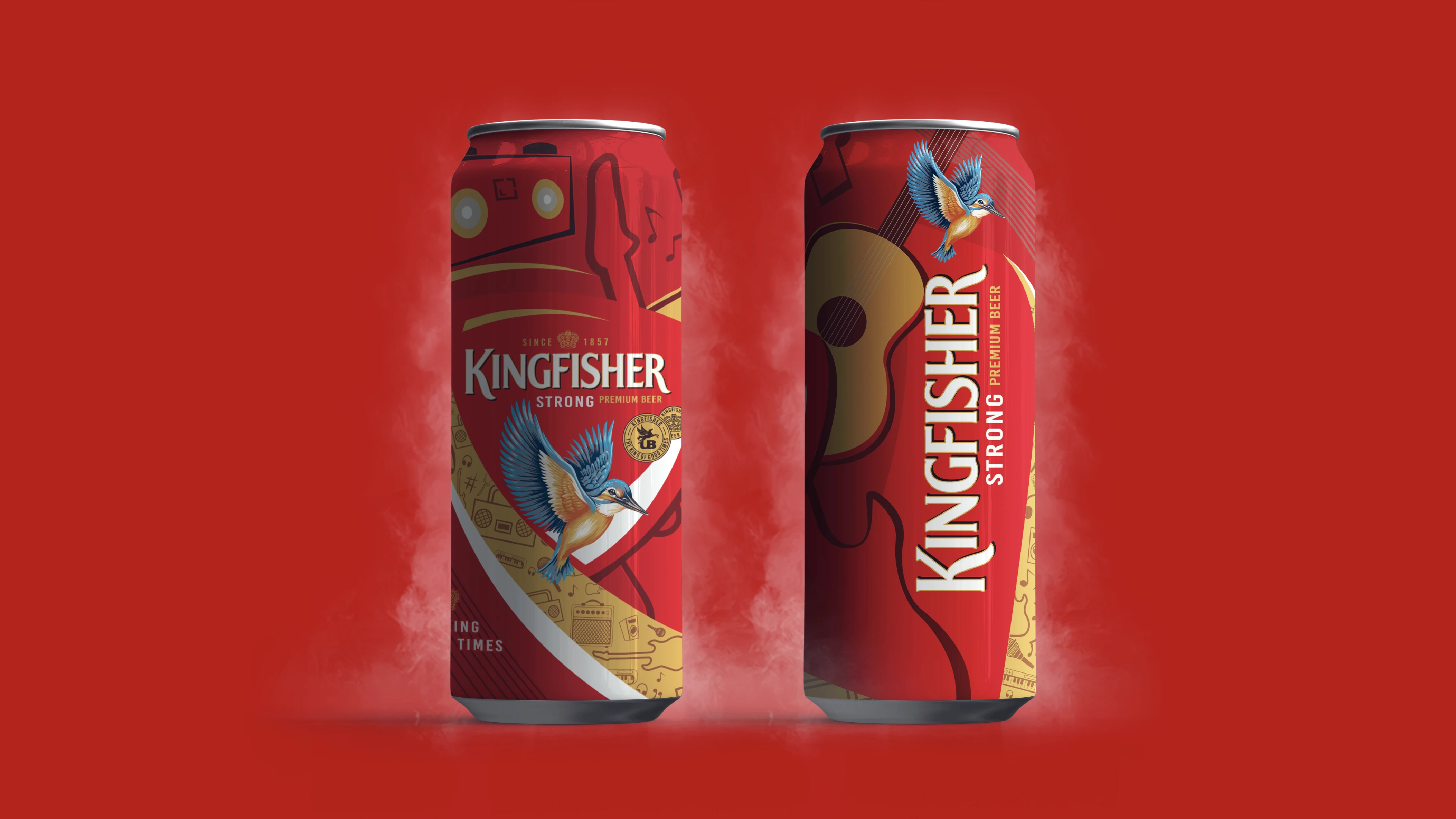
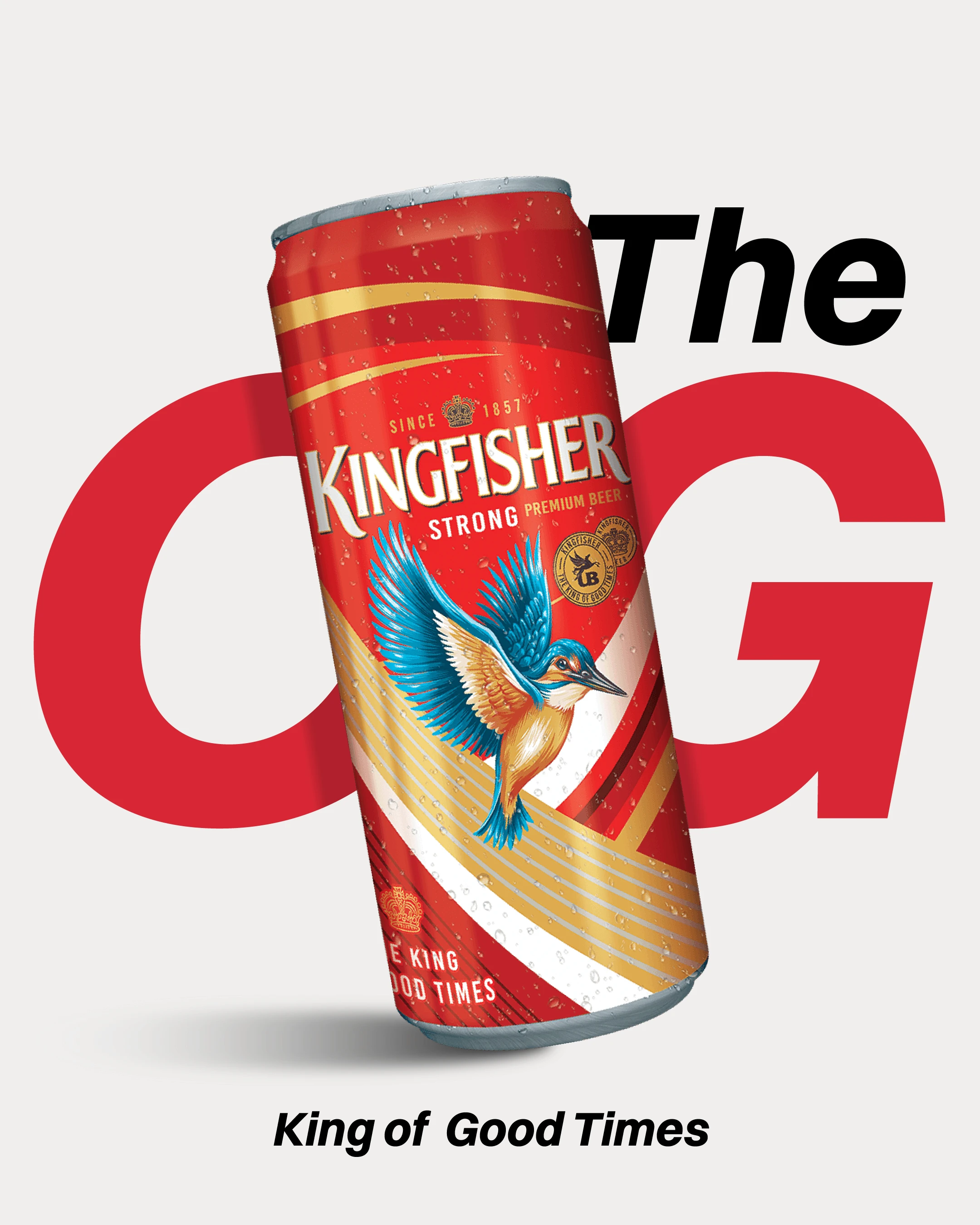
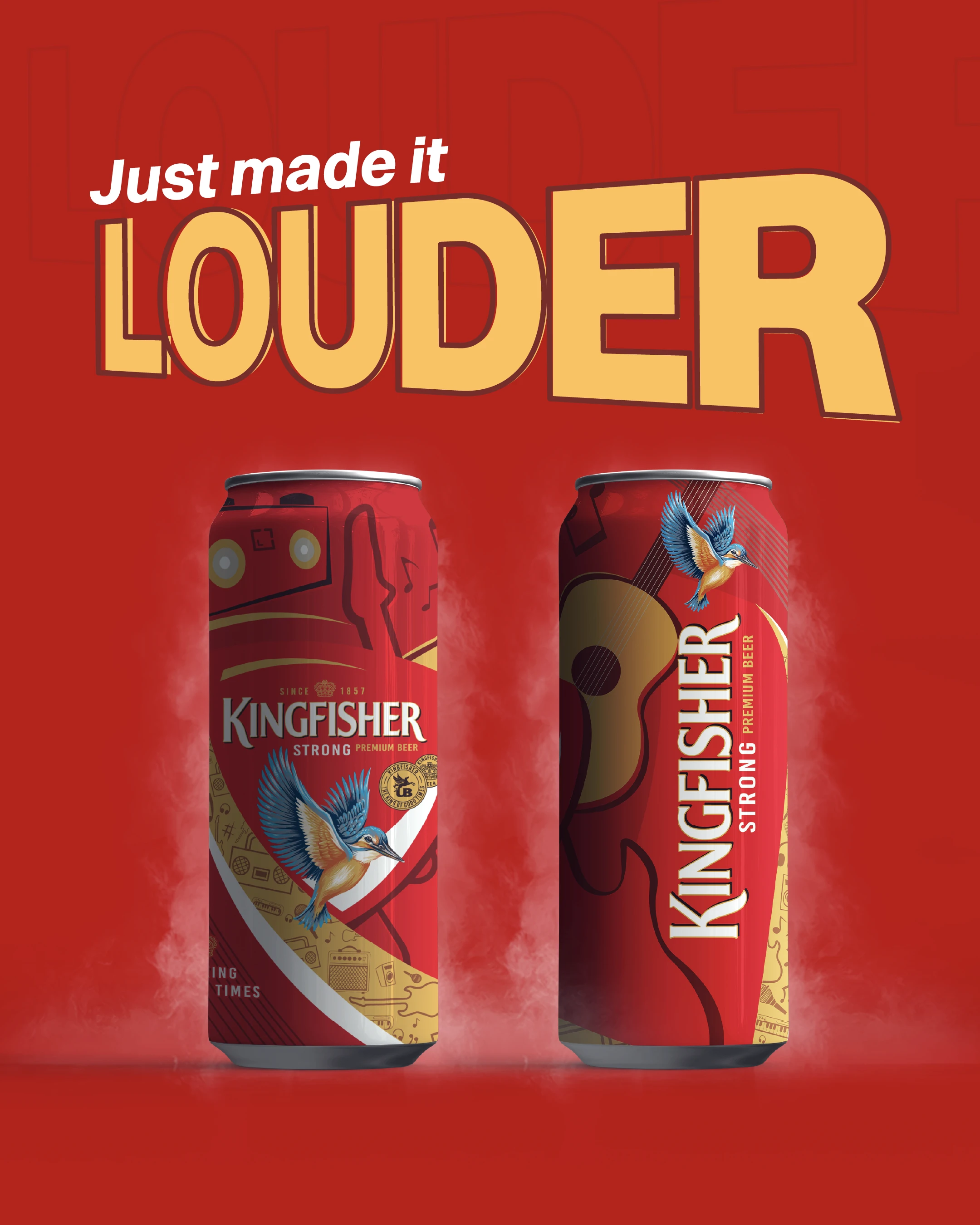
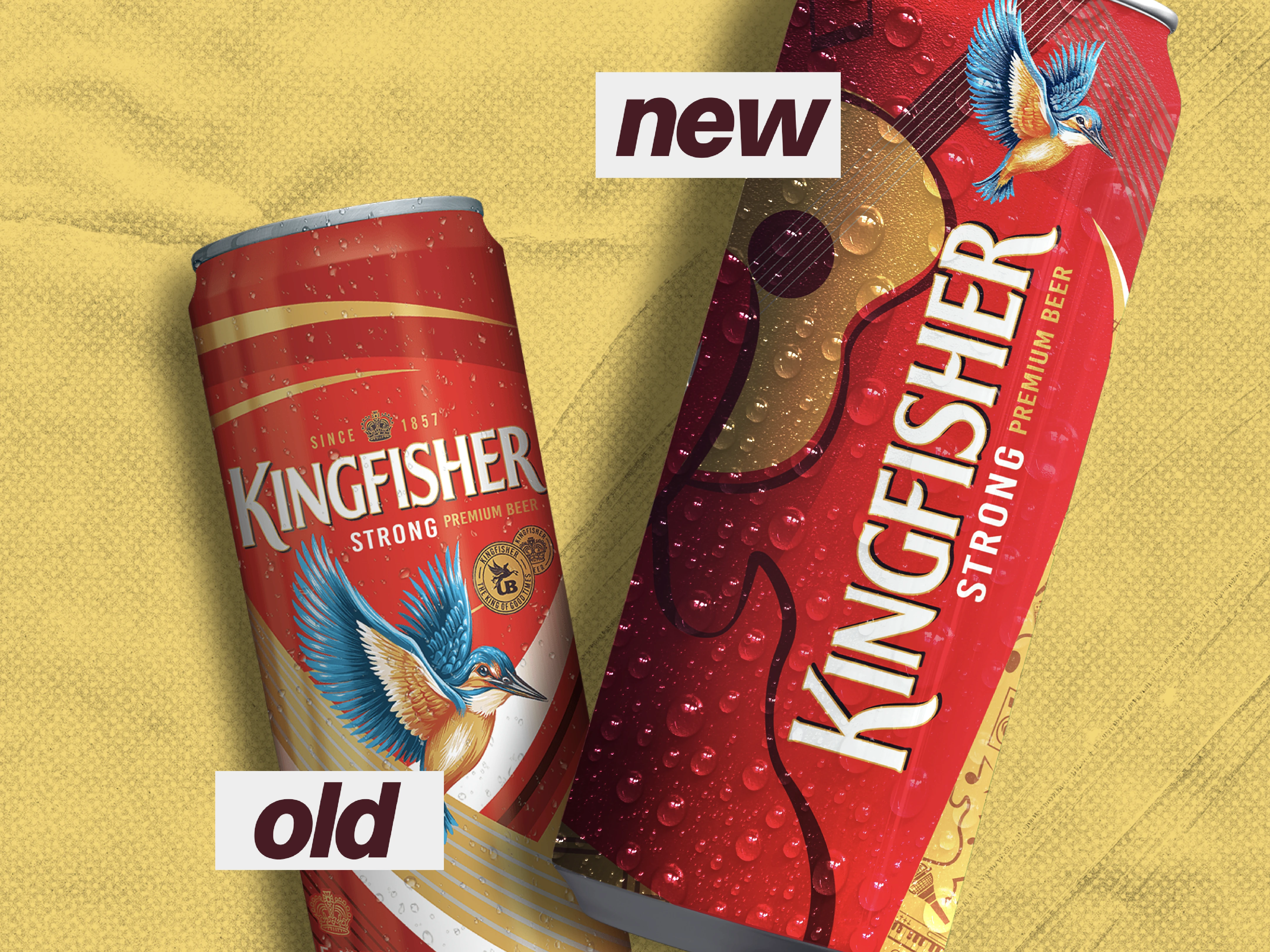
The brief was simple: design a can that captured the emotion of music. Kingfisher is an OG brand in India: instantly recognizable, iconic, and part of countless shared moments. The challenge wasn’t to reinvent it, but to amplify it. The design stays true to Kingfisher’s legacy while turning up the volume with a bold musical twist. One side of the can bursts with speakers and beats, while the other flows into the smooth silhouette of a guitar. Subtle golden icons thread through the layout, adding rhythm and energy without straying from Kingfisher’s classic red-and-gold palette. Custom music illustrations were created to enhance this vibe guitars, speakers, and notes drawn in bold tones, with colours overflowing the borders to capture movement and atmosphere. The result is a can that feels alive, embodying both the energy of music and the timeless spirit of Kingfisher.
illustrations that work
Every detail of the artwork was designed to feel immersive, drawing inspiration from India’s long-standing love affair with both music and celebration. The golden icons wrapping around the can were carefully chosen to reflect cultural references — microphones, records, and instruments — turning the surface into a continuous visual rhythm. This layered approach ensured the product wasn’t just decorative but told a story of community, sound, and festivity. Ultimately, the Musical Edition packaging celebrates Kingfisher’s place as more than a beverage; it positions the brand as a cultural companion. By staying true to its heritage while embracing playful, music-inspired visuals, the design amplifies Kingfisher’s identity as the drink of good times, now louder and more dynamic than ever.


